
Forms are an inevitable part of any online store, from user accounts to check-out, customers will need to fill out at least one form when using your website. Hopefully, through this blog, we can help you make this process a little more user-friendly.
Don’t ask too many questions
Users can be instantly put off if presented with a form that has more questions than a tax return, and in turn, this can lead to a rise in the number of customers dropping out.
So one of the first tasks should be to review the fields within your form and ask yourself ‘is this data essential?’ and if it isn’t, why are you asking for it? By doing so, you could decrease the length of your forms which in turn would lower your users’ cognitive load – leading to more customers filling out the form.
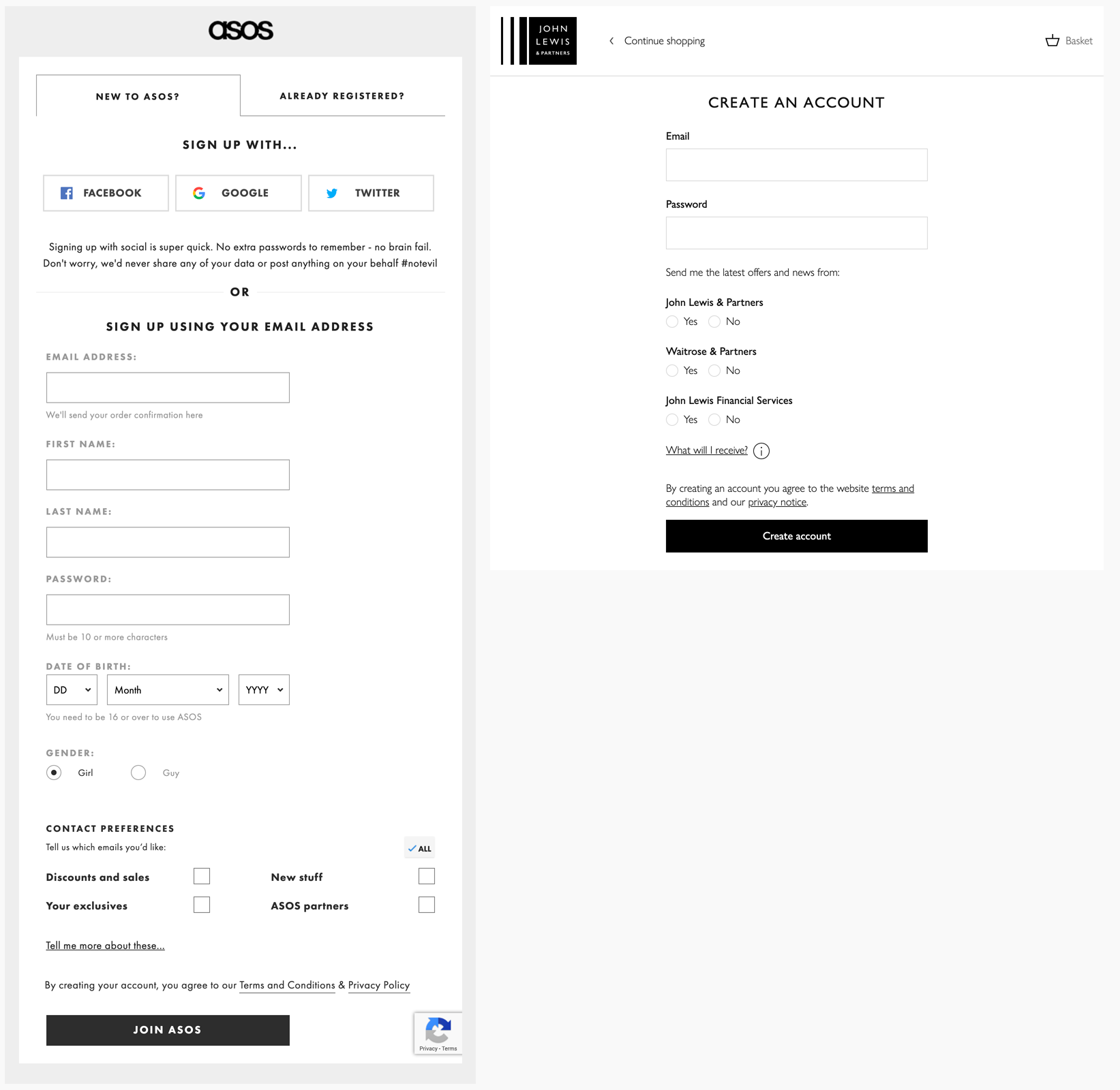
You can see from the example above how John Lewis have streamlined sign-up form compared to that of ASOS by removing fields that cannot be properly validated against (as any user could lie about their name or age. Also, there isn’t a good reason to separate the first and last names in the context of this form).
This has created a simpler and more inviting form for first-time customers.
Placeholders ≠ Labels
“Labels tell users what information belongs in a given form field and are usually positioned outside the form field. Placeholder text, located inside a form field, is an additional hint, description, or example of the information required for a particular field. These hints typically disappear when the user types in the field.” — Katie Sherwin of Nielsen Norman Group.
A lack of labels will make it difficult for customers to quickly scan through a form and make sure that they have input the right information. On top of that, many users now use browsers that use auto-complete to fill in forms instantly. So, if there aren’t any labels there is no way for a customer to validate the data they have input, thus increasing the likelihood of errors.
A way around this becoming an issue could be to use ‘floating labels,’ which are labels styled to mimic the styling of placeholder text, but which remain visible when the field is active.
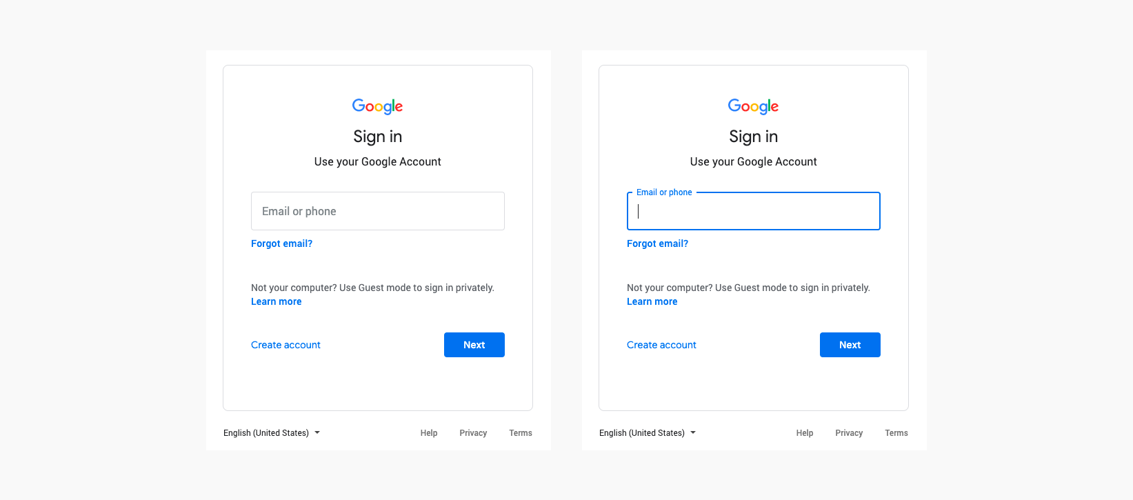
Google uses these ‘floating labels’ to great effect on their forms; by placing the label over the field, they reduce clutter but once active are still scannable by users.
Group related fields together
One of ‘Gestalt’s Principles’ states that humans make connections through things that are closely grouped together. So it would make sense for fields of related content to be next to each other. Any time a user comes across an instance of this, they will find this jarring.
Logically grouping fields together gives the customer the illusion the form can be completed quicker.
An example of this would be keeping the address fields on a form together in the order they would normally appear on a piece of post and not breaking the flow up by asking the user something unexpected, for instance, a telephone number.
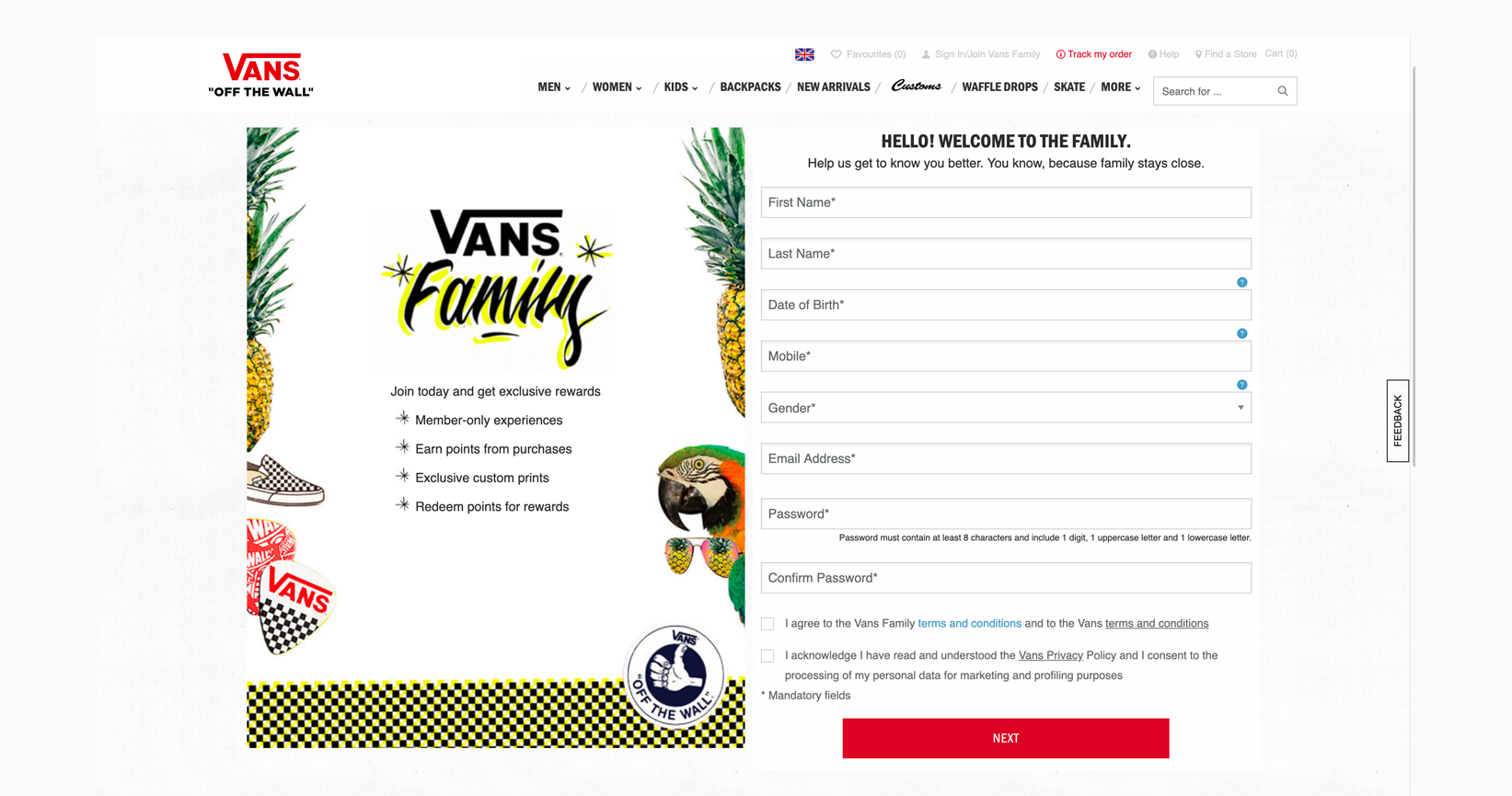
On the Vans registration form, the flow of required personal information is broken by the request for a telephone number. This can lead to customers questioning your intentions, affecting conversions in the long run.
Size matters
You can use the size of the input fields to set customers expectations when they are scanning through a form. If a field requires a fixed number of characters, the field should only accommodate that many characters.
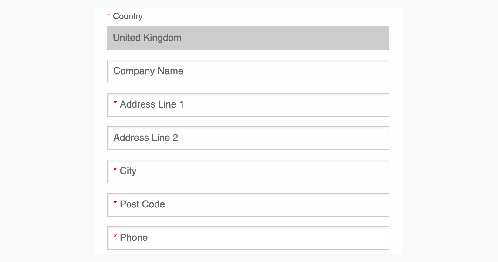
You can see on Vans checkout in the ‘Delivery Information,’ the ‘Post Code’ field is as wide as all the other fields, even though it only requires seven characters.
Let customers know what you want from them
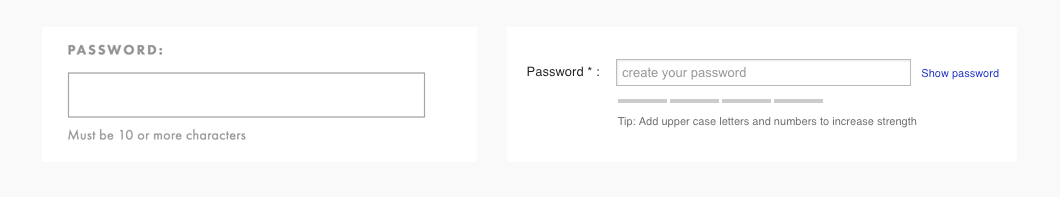
Tell the users what is required out of them. Don’t wait until they’ve completed the form to show them an error message — which is a form of negative reinforcement. The user won’t know what is expected out of them if there’s no clear indication of the validation rules. This is especially applicable to the “password” field as different products will have different requirements.
Don’t expect to keep a potential customer happy when they submit a form only throw validation errors, because you didn’t explain what you require of them. If a password field has special requirements, let the user know.
Going back to an earlier example, you can see ASOS lets the user know that password field needs at least 10 characters, whereas Curry PC World gives only a vague instruction without a real expectations until the user has filled in the field.
The logic behind this can also be applied to the use of ‘tooltips’ on forms, although these seem to help keep a form tidy and alert users to important information. They actually just add an unnecessary action for users to find out what you require them to do.
************?
The security of the password field is important, but not as important as knowing you have typed it correctly. The increase of mobile browsing comes a greater use of touchscreen keyboards, and with that = increase in typos.
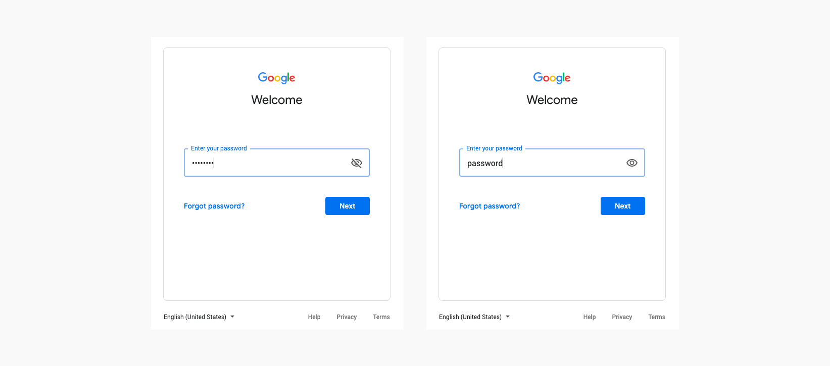
Adding the option to toggle what a user has typed can reduce frustration, especially on registration pages where users are asked to type and then re-type a password – without any validation of their input. It’s a very simple thing to implement and will add reassurance to users.
One more thing…
Don’t forget your ‘tab index’, nothing disrupts the flow filling in a form than having to stop and manually highlight a field, a user should only perform this when correcting an error.
Remember forms aren’t meant to be fun, but they’re not meant to be painful either!